 Install Flashable Zip Menggunakan TWRP / CWM / Philz Recovery | Apakah Anda bosan dengan tampilan stock
Android yang begitu-begitu saja? Apakah Anda berkeinginan untuk memodifikasi
tampilan Android Anda? Jangan khawatir, perangkat Android dilengkapi dengan
jaringan pengembang besar yang akan membuat mods baru dan aplikasi untuk
perangkat Anda yang akan membuat perangkat Anda lebih menarik dari sebelumnya.
Anda bisa mendapatkan banyak aplikasi dari Play Store yang akan mendesain ulang
ponsel Android Anda.
Install Flashable Zip Menggunakan TWRP / CWM / Philz Recovery | Apakah Anda bosan dengan tampilan stock
Android yang begitu-begitu saja? Apakah Anda berkeinginan untuk memodifikasi
tampilan Android Anda? Jangan khawatir, perangkat Android dilengkapi dengan
jaringan pengembang besar yang akan membuat mods baru dan aplikasi untuk
perangkat Anda yang akan membuat perangkat Anda lebih menarik dari sebelumnya.
Anda bisa mendapatkan banyak aplikasi dari Play Store yang akan mendesain ulang
ponsel Android Anda.
Showing posts with label Tutorial. Show all posts
Showing posts with label Tutorial. Show all posts
Install Flashable Zip Menggunakan TWRP / CWM / Philz Recovery
Install Flashable Zip Menggunakan TWRP / CWM / Philz Recovery | Apakah Anda bosan dengan tampilan stock
Android yang begitu-begitu saja? Apakah Anda berkeinginan untuk memodifikasi
tampilan Android Anda? Jangan khawatir, perangkat Android dilengkapi dengan
jaringan pengembang besar yang akan membuat mods baru dan aplikasi untuk
perangkat Anda yang akan membuat perangkat Anda lebih menarik dari sebelumnya.
Anda bisa mendapatkan banyak aplikasi dari Play Store yang akan mendesain ulang
ponsel Android Anda.Solusi dan Cara Mengatasi Android Bootloop
 Inilah Solusi dan Cara Mengatasi Android Bootloop | "Bootloop" adalah
istilah yang sangat akrab bagi pengguna smartphone yang mereka gunakan, namun
lebih akrab bagi pengguna ponsel Android. Android menjadi sistem operasi Open
Source, terbuka untuk modifikasi pihak ketiga. Jika Anda memiliki pengetahuan
dasar atau lanjutan dari Linux coding, Anda dapat mengembangkan Custom ROM atau
memodifikasi file sistem ponsel Android Anda. Keterbukaan tersebut telah
membuka wawasan baru bagi para pengembang untuk mengedit ROM, mods dan hacks.
Disatu sisi ini dapat menambah pengetahuan kita mengenai Android, tapi tentunya
hal ini bisa menimbulkan beberapa masalah seperti bootloop atau brick pada perangkat.
Inilah Solusi dan Cara Mengatasi Android Bootloop | "Bootloop" adalah
istilah yang sangat akrab bagi pengguna smartphone yang mereka gunakan, namun
lebih akrab bagi pengguna ponsel Android. Android menjadi sistem operasi Open
Source, terbuka untuk modifikasi pihak ketiga. Jika Anda memiliki pengetahuan
dasar atau lanjutan dari Linux coding, Anda dapat mengembangkan Custom ROM atau
memodifikasi file sistem ponsel Android Anda. Keterbukaan tersebut telah
membuka wawasan baru bagi para pengembang untuk mengedit ROM, mods dan hacks.
Disatu sisi ini dapat menambah pengetahuan kita mengenai Android, tapi tentunya
hal ini bisa menimbulkan beberapa masalah seperti bootloop atau brick pada perangkat.Cara Menonaktifkan Aplikasi Sosial Media Sementara di Android
 Cara menonaktifkan aplikasi sosial media sementara di Android - Seperti yang kita tahu bersama bahwa
sosial media kini menjadi alat komunikasi instan yang cukup digemari oleh
masyarakat di tanah air. Seperti misalnya Facebook, Instagram, Twitter, dan
beberapa aplikasi instan messenger seperti BBM, WhatsApp, Hangout, Line, dan
lainya. Tentunya dari setiap sosial media memiliki aplikasi yang bisa di pasang
pada perangkat Android untuk mempermudah penggunanya.
Cara menonaktifkan aplikasi sosial media sementara di Android - Seperti yang kita tahu bersama bahwa
sosial media kini menjadi alat komunikasi instan yang cukup digemari oleh
masyarakat di tanah air. Seperti misalnya Facebook, Instagram, Twitter, dan
beberapa aplikasi instan messenger seperti BBM, WhatsApp, Hangout, Line, dan
lainya. Tentunya dari setiap sosial media memiliki aplikasi yang bisa di pasang
pada perangkat Android untuk mempermudah penggunanya.Tutorial Illustrator Cara Membuat Geometris, WPAP Vector Portrait
sebuah tutorial vektor dari legenda sejati, Wedha Abdul Rasyid.
 Wedha, berasal dari Indonesia, menciptakan karya seni di media tradisional di awal 1990-an, yang kemudian pada awal tahun 2000, menyeberang ke dunia digital. Vector menjadi pilihan alami untuk seperti warna-warni, gaya geometris.
Sejak itu, ia telah mendapatkan popularitas besar di Indonesia, dengan beberapa komunitas yang didedikasikan untuk penciptaan dan menampilkan potret dalam gaya WPAP, dengan anggota dalam ribuan mereka! Dengan kebangkitan tren geometris, itu adil untuk mengatakan bahwa WPAP mungkin berani keluar dari Indonesia dan masuk ke lebih banyak aspek desain.
Create a Burning, Vector Match Using Gradient Meshes
 In this tutorial you will learn how to create realistic vector fire, using the Gradient Mesh Tool and Screen Blending mode. Believe me, there's nothing overly complicated. Let's strike a match!
Republished Tutorial
Every few weeks, we revisit some of our reader's favorite posts from throughout the history of the site. This tutorial was first published in April of 2011.
Design a Delicious, Shining Circle Play (Web) Button in Photoshop
 In this tutorial, I will show you the steps I took to create this interesting Shining Orb Circle Play (Web) Button in Photoshop . This is an beginner level tutorial and steps are quite easy to follow, have a try Along the way, we will practice some basic drawing skills and adding light effect onto the elements, as well as the use of Pen Tool, layer blending mode and selection techniques.
Create a Glossy Volt Icon in Photoshop
 First of all I would like to thank Negreu Andreas for collaborating with me in creating this tutorial. This is an inspiration from the Bolt movie poster. In this tutorial you will create a glossy thunder logo using a few layers and some white shapes that will make the thunder more interesting and glossy.
Quick Nav:
Create a Custom Mac OSX Style Ring Binder Address Book Icon
 Today I'll show you how to create an Address Book replacement icon for Mac OSX. When you are a beginner, it's better to start with designing replacement icons to get some practice. Let's get started with personalizing the icons in our workspaces.
Icons vector tutorial in Corel Draw
In this tutorial you will learn about how to create some nice and professional vector icons in Corel Draw. After reading this tutorial you will know to center objects, to apply the Fillet effect, how to use the Mirror and much more.

Icons vector – Step 1
In this step we need to create the workspace. Create a New Document, type a name and select the pixel units with the size600 width and 600 height. Select the rendering resolution to 72 dpi. Then select the options from the top menu: Windows -> Toolbars like in the screenshot.

Select the View Mode to Enhanced from the View drop down menu and the Snap to Objects option.

Step 2
Select the Rectangle tool from the Toolbox and create a rectangle (70 x 50 px). Create another rectangle (24 x 20 px) and center it with the previous one like in the second screenshot. For doing this you need to hold Shift, select the small rectangle, then the big one and hit C (center horizontally). Then hold Ctrl and drag the small rectangle until the center intersect the midpoint of the big one. Create another rectangle (16 x 12 px) and center it with the previous one. Now select from the Toolbox the Smart Fill tool and click in the handle area. Delete the previous created rectangles (24 x 20 px and 16 x 12 px) and create another two (4 x 40 px). Center them vertically (holding Shift, select the rectangle (4 x 40 px), then the big one (70 x 50 px) and hit E (center vertically)) and create another rectangle (7 x 20 px) for adjusting the horizontally position (see the sixth screenshot). Note! You can use Ctrl + Home for getting object in front of page.

Step 3
Select from the Menu, Window -> Dockers -> Fillet/Scallop/Chamfer and apply the Fillet effect to the big rectangle with theRadius 8 px. Then apply the Fillet effect to the small rectangles with the Radius 2 px. And finally, apply again the effect for the top two nodes from the handle. For doing this select the object, then the Shape tool (F10) from the Toolbox and select the two nodes.

Step 4
Now set the Fill color of the handle to white. Hold Shift and select the bar and then the big rectangle and hit Trim from theProperty bar. Delete this two objects and you will have now two hole in the big rectangle. Select all the objects and hit Weldfrom the Property bar. You will have now only one object, the bag.

Step 5
In this step we will begin to create the e-mail icon. Create again a rectangle (70 x 50 px) and apply the Fillet effect with theRadius 8 px. Create another rectangle (4 x 80 px) and rotate it with 60-degrees. Create another copy of this rectangle and from the Property bar hit Mirror Horizontally. Then drag one rectangle until you intersect with the other one like in the fourth screenshot. Select this two rectangles and hit Weld.

Step 6
Hold Shift, select the bar, then the rectangle and hit C (center horizontally). Now hold Ctrl, select the bar and drag it until you think that look like in the first screenshot. Hold Shift, select the bar and then the rectangle and hit Trim from the Property bar. Delete the bar and now you have the e-mail icon. Select the Shape tool (F10 from your keyboard or from the Toolbox) and apply the Fillet effect for that two nodes like in the second screenshot (with the Radius 6 px and 8 px).

Step 7
Create a rectangle (50 x 36 px) and apply the Fillet effect with the Radius 6 px. Create two circles and center them like in the second screenshot. Create a rectangle and arrange it like in the third screenshot (in the middle of the circles). Now select theSmart fill tool from the Toolbox and click in the top area. Delete the circles and the rectangle (see the fourth screenshot). Select the rectangle tool, hold Ctrl and draw a rectangle from the first node of the top object to the second. Then drag from the bottom side of the rectangle until intersect the big one (see the fifth screenshot). Create another copy of this new rectangle, hold Ctrl and move it to the right side.

Step 8
Select all the objects and hit Weld. Now we will create the keyhole. Create a rectangle (6 x 12 px) and a circle (10 x 10 px) and center the circle with the top side of the rectangle. Select this two objects and hit Weld. Apply Fillet to the bottom two nodes with the Radius 3 px.

Step 9
Apply Fillet to the middle two nodes with the Radius 6 px and we have the keyhole. Now we will center it with the lock. Hold Shift, select the keyhole, then the lock and hit C (center horizontally). For vertical alignment you can create a rectangle like the red one from the second screenshot and align the keyhole with this one, then delete it. Now select the keyhole, then the lock and hit Trim. Delete the keyhole and you will have now only one object, the lock.

Step 10
Create three rectangles and align like in the first screenshot. The red one is only for alignment. Select all the objects and hitCtrl + Q (Converte to curves). Select the Shape tool (F10), select the bottom two nodes and apply the Fillet with the Radius 8 px. Select the top rectangle and apply Fillet with the Radius 2 px and then apply the Fillet with the Radius 8 px to the top nodes of the middle rectangle. Select all the objects and hit Weld.

Step 11
Select the object and hit Ctrl + K (Break curves apart). Will result two objects. Select the bottom one and a new created rectangle (4 x 40 px) and hit C (center horizontally) and E (center vertically). Create another two copies of the new rectangle (4 x 40 px) and arrange them like in the fourth screenshot. For arrange them you can create a temporary rectangle with the size 9 px horizontally. Apply Fillet to this three rectangles with the Radius 2 px and then Trim this rectangles from the back object. Delete this rectangles and we will have now three holes. Then select the both objects and hit Weld for having only one object.

Step 12
Let’s create the backgrounds. Create four rectangles (128 x 128 px) and align like in the screenshot. For doing this you can create two temporary rectangles (20 x 60 px, 60 x 20 px). After you are ready with the alignment, select all of them and apply the Fillet effect with the Radius 8 px.

Step 13
Color the rectangles like in the screenshot. Center all the icons with the backgrounds. For doing this you can holding Shift, select the icon, then the background and hit C (Center Horizontally) and E (Center Vertically). Select all the objects and remove the Outline (right mouse click in the “X” from the color palette). Select all four icons and fill with the colorR(255)G(241)B(206).

And this is the finally result.

posted by: http://coreldrawtuts.com
How To Create a Print-Ready Brochure Design in PS
It is easy to design brochures using Adobe Photoshop but designing a great layout that is already print ready requires some specific additional setups. In this tutorial, we will go through the process of setting up and designing a brochure that's ready for printing. Let us get started.
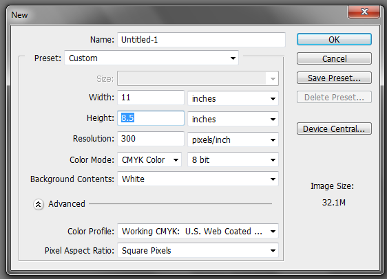
1. The important thing you must remember when setting up a "print ready" design is that you must setup the document properly early on. You will face a lot of issues with your document if you only adjust your design for printing at the last part of the process. This means that once you create a new document in Photoshop, know that you should already be specific with your settings. For a typical "letter-sized" TRIFOLD brochure, the basic settings that you should try out are listed below. Just modify the dimensions here as you see fit.
a. Dimensions (WxH): 11x8.5 inches (a landscape oriented letter sized document)
b. Resolution: 300ppi (minimum recommended for printing)
c. Color Mode: CMYK (for four color printers)
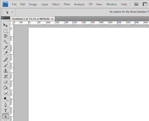
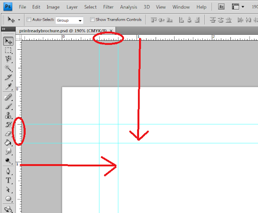
2. Once we have setup the main document, we are now going to add the guidelines. Guidelines are important in making your design print ready as it will help you place your design elements correctly within the bounds for printing. To start creating guidelines you must first have the rulers visible in your Photoshop. If you do not see rulers in your document, press CTRL+R or go to View -> Rulers. You should see the rulers appear at the edges of your document.
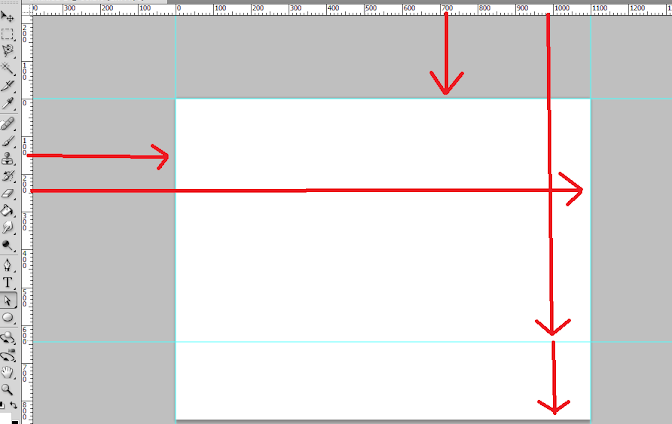
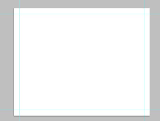
3. Great! Now we are going to define the edges of our document by using the guidelines. Simply click and drag your mouse from the horizontal or vertical ruler to the document. Place the light blue guideline at the precise edge of the canvass. (do not worry about it being at the edge, you will see them clearly enough layer once we increase the size of our document. For now, make sure they are in the correct place.
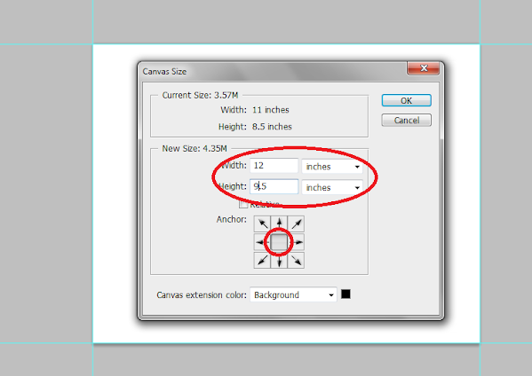
4. Now, we shall make our canvass size bigger. Go to Image -> Canvass Size… Add 1 inch to the width and height values. Also make sure that the anchor is set to the center. By doing this we basically create a margin for our document.
5. It should now have some borders like the picture below. Take note that if your background color is not white, and is set to a different color, the new spaces will probably reflect that color. So just fill those areas with white with the paint bucket tool.
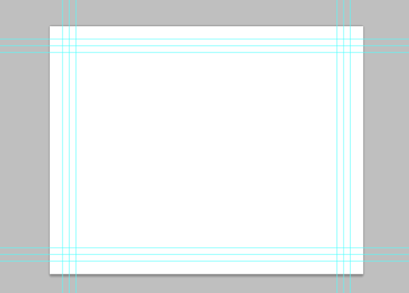
6. Now, we setup the bleeds. Zoom in a bit on a corner of the canvass (hold the ALT key and use the middle scroll mouse button to zoom in easily). Now, create an additional guideline that is 0.25 inches away from our initial margin. This will be the bleed. This margin is the leeway that a designer gives for discrepancies in printing. Do this for all four sides of our document.
7. Also, in the same fashion, create a security guideline set. These are the guidelines where no text or graphic must cross. This is our main design border so to speak so that no elements get too close to the edges of our design. Just set these guidelines at 0.25 inches away from our bleed border. In the end, you should have something like this:
8. Great! Now, before starting with the design. Take note that a Trifold brochure has three major parts or panels. We will create the column guides so that it is easier for you to see where the folds of the trifold brochure will be. To do this easily, create a rectangle shape with a grey color using the Rectangular shape tool. (Do not worry, it can be any size.) Make sure of course that you start from the shape from the corner of our bleed of course to span the whole height of that area. Then, duplicate this shape two times (press CTRL+J). Position the duplicates at the side of the original rectangle. In this example, we have changed the color of the shapes so that they are easily visible.
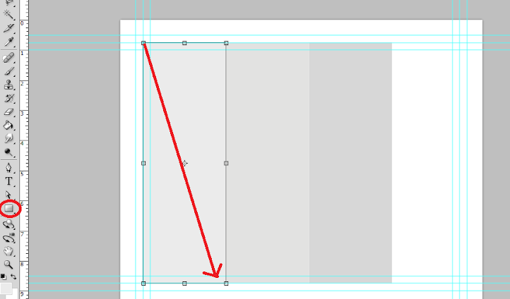
9. Now, to make the columns equally distributed across the document, we select all three rectangles in the layer panel. Just hold down the shift key and click on all three layers. Afterward, press CTRL+T to enable the transformation of the shapes. Drag the transformation box to the right side bleed border.
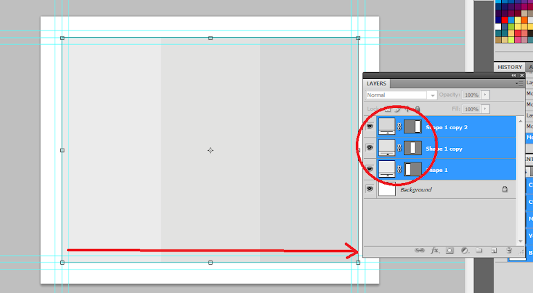
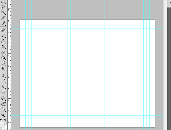
10. With those panels in place, you should see where you should put your panel or column guidelines easily. Just add those guidelines like you did with the others. ALSO, add a security border on the left and right side of them as needed. Delete the rectangles once done. In the end we should have a FINAL looking guide document like the picture below. Now would be a good time to save our document as a brochure template.
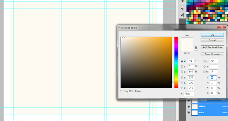
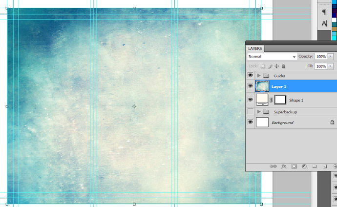
11. Now, before we go forward with our design, we will just setup a base background and some trim guides. Using the rectangle shape tool, we have created a new rectangle with a theme color. Here we are using an off white color (#fffaf1). Make sure it spans our guidelines including the bleed area. This should mark the whole span of the document.
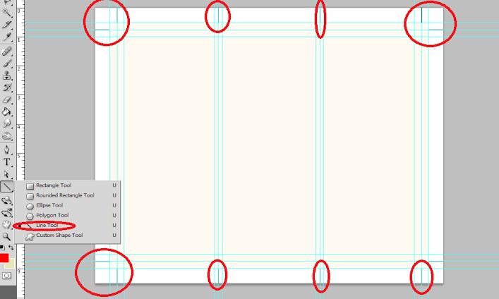
12. Next, using a simple line tool we place in a 1pixel line as trim guides. Use the guide lines for the bleeds to add the trim lines at the outer edge of our design like so. Create a new group and place all these line layers within that group to make things more organized.
13. Great! Now make a final save for this template. You should now be ready to create the real design. Create a new save file (after creating your file template) and name is as your new brochure. Then paste in the background texture or color that you want for your design. Here we are using a grunge texture to establish the theme that we want. We got this for free through this generous person on deviant art. (cloaks.deviantart.com/art/Grun….
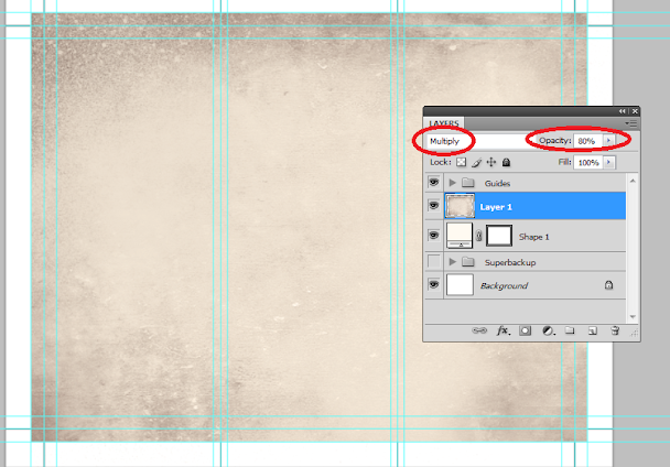
14. Then, press CTRL+SHIFT+U to desaturate our texture layer. Change the blend mode of this texture layer to "Multiply". This is done through the layers panel. Reduce also its opacity to around 80%.
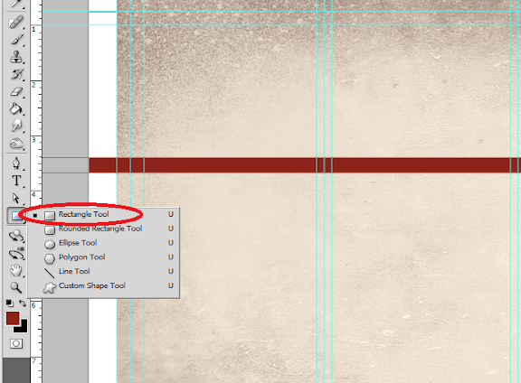
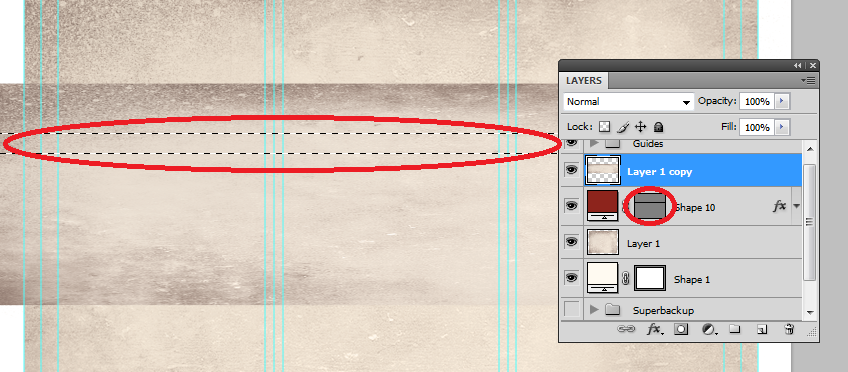
15. Now we shall add additional elements to our design. First we create some ribbons. Using the rectangle shape tool we inscribe a red stripe across our design.
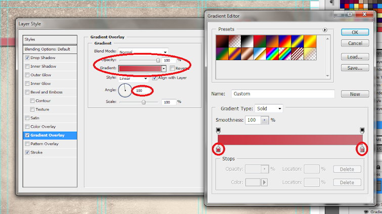
16. Then, double click on the stripe layer. The layer styles and blending options window should open. We will now add some extra effects on our stripe to make it look better. First up is a Gradient Overlay. We click on the Gradient Overlay checkbox and change the color gradient fill by clicking on its box. Make sure to use a good blending of two colors that matches your theme of course in the gradient editor. Also, change the angle of this layer style to 100 degrees.
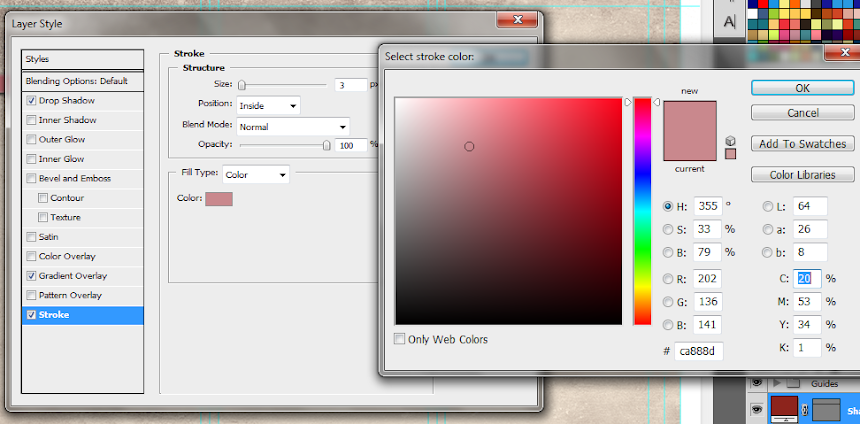
17. Then, click on "Stroke". Change the following attributes.
a. Size: 3px
b. Position: Inside
c. Color: (use a lighter shade of your gradient).
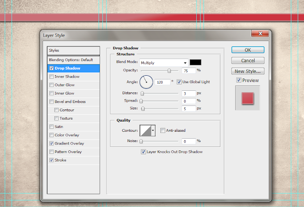
18. Finally, add a drop shadow. Just click on the drop shadow checkbox then change the following values:
a. Drop Shadow color: Black
b. Distance:3px
c. Size: 5px
d. NOTE: you can adjust the values depending on how big or small your stripe is.
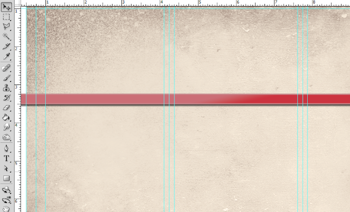
19. Once done, you should get something like the picture below. Now, in terms of color this is great, but it is too clean. This means that we will want to add texture.
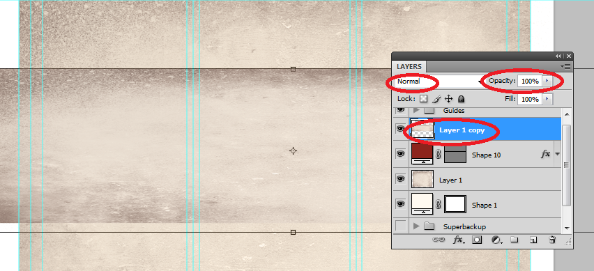
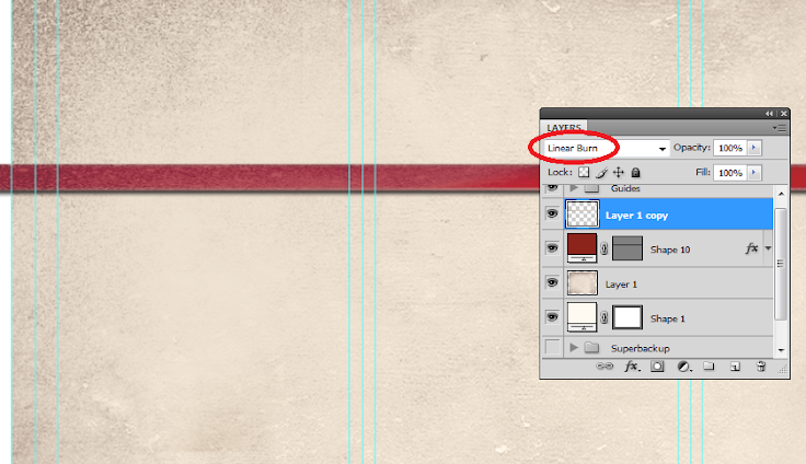
20. To add a texture, we will just use our background texture image. To do this, first duplicate our texture layer by clicking on it in the layers panel and pressing CTRL+J. Then, we move it to the front of our red stripe layer. Change the blend layer back to normal and up the opacity back to 100%. Afterwards, we reduce its size a bit by pressing CTRL+T and then shifting the size to match with the stripe.
21. Now, we will delete the areas of the texture. To do this, hold down the CTRL key and click on the thumbnail of image mask of our stripe (NOT THE TEXTURE). Then press CTRL+SHIFT+I to select the inverse of the stripe layer.
22. Then, click on the texture layer, and then start erasing its edges, leaving only the texture within the stripe area.

23. Finally, change the blend mode of our stripe text layer to "Linear Burn". This gives us that great texture effect to our stripe. For now, we have removed the guidelines for you to view the textures much clearer. Remember that you can turn on or off the visibility of the guidelines by pressing CTRL+H.
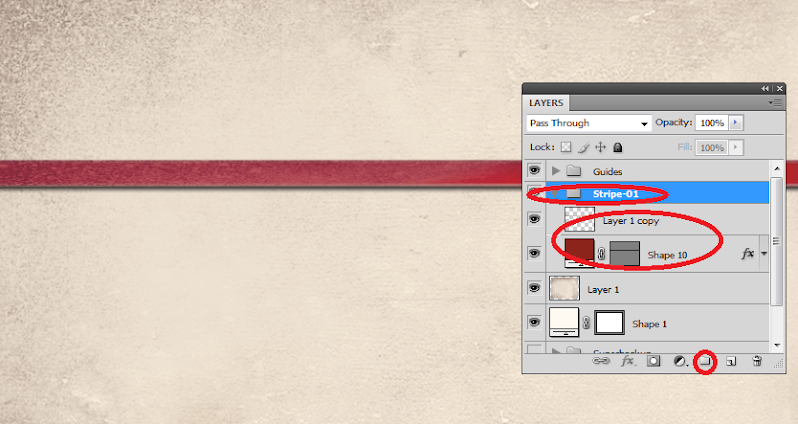
24. Once you are happy with your stripe, create a layer group with this modified texture and the main red stripe. You can do this easily by clicking on the "create a new group" icon in the layers panel.
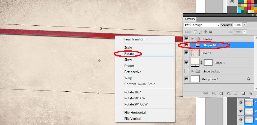
25. Now, with the group selected, we rotate the stripe so that it is at an angle in a creative fashion. To do this, press CTRL+T to transform our stripe group. Move your mouse over the edge of the box and then just drag your mouse to start rotating the stripe.
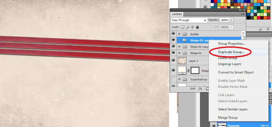
26. Now, right click on the Group layer and select the option "Duplicate Group". Do this at least two times to create a total of 3 stripes in our design. Transform and rotate these stripes as you see fit for your design.
27. Here is a nice trick. If you want to change the colors of the ribbon, all you have to do is to go into one of the ribbon groups, double click on the actual stripe layer to access its layer styles and then just change the gradient overlay settings with your choice of colors.
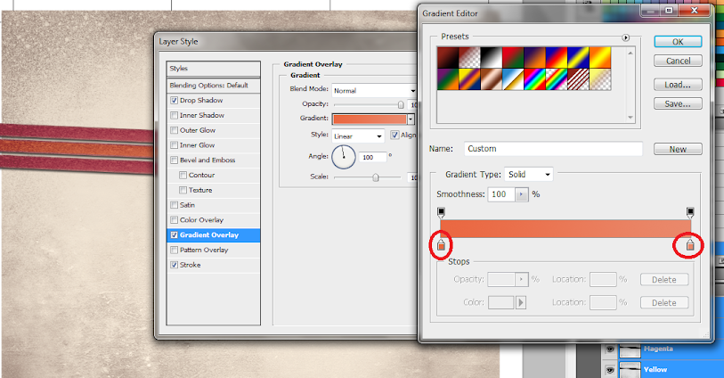
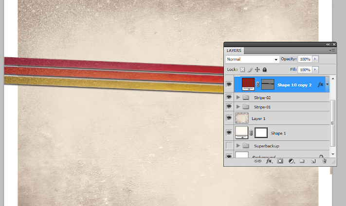
28. For our example we changed the gradient overlay colors for the second and third duplicate stripes to get a nice multi-colored effect for them. Of course, just match the change of colors depending on your color theme.
29. Now, we add the title. Using the text tool we write in our title in a theme color, here we will be using a very dark brown. Just use the font style that fits your theme of course. Also, position the text just above the ribbons or stripes. Take note that the title must be on the right most panel as that is the cover area of brochures in printing. Also remember that you can use the character panel to adjust the line spacing, character spacing and a myriad of other text features and attributes. This should help you edit your title as you see fit correctly.
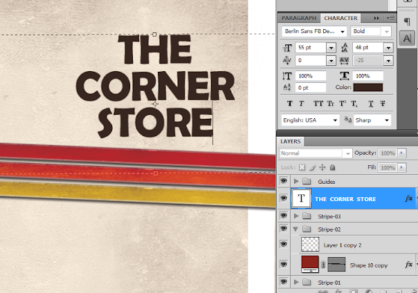
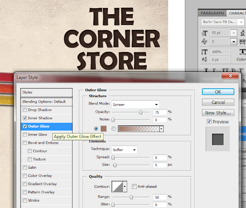
30. Then we go to the layer options for the text. Double click on our text to access those options. First, click on the outer glow option. Change the color of the outer glow to a slightly lighter version of the dark brown color that we used.
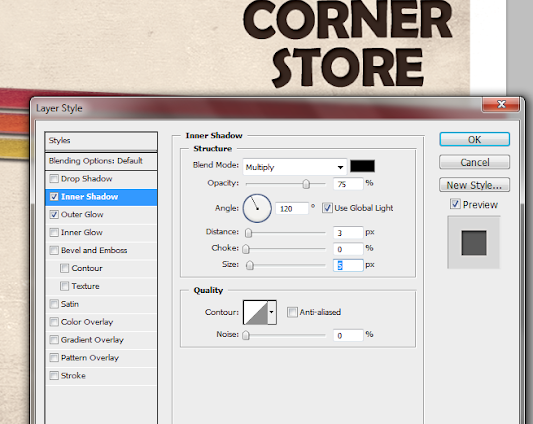
31. Then, click on Inner Shadow. Use a black shadow, with a 3 distance and a 5 pixel size.
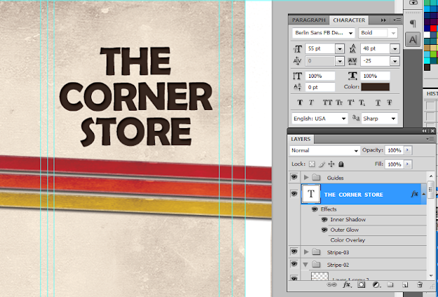
32. Once we apply the layer styles, it should look something like the image below. Take note of the guidelines again. Make sure that your text title is well within the security lines that we placed. Toggle the lines on and off by pressing CTRL+H.
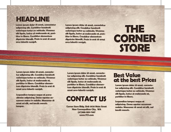
33. Great! Now, just type in the rest of your content. Orient them appropriately on the three panels. Again note that the right most panel is the cover, the middle panel is actually the BACK cover and the left most panel is the inner flap. DO NOT FORGET to always put in the main text paragraphs within the guidelines. We also used the same layer styles in the title for the headlines and sub-headlines.

34. Once we hide the guidelines you should see something like this:
35. Great! Now you have the FIRST SIDE of our brochure. In the next installment of the tutorial we will work on the other side. However, by now, you should know most of the tricks for creating a basic brochure design.
1. The important thing you must remember when setting up a "print ready" design is that you must setup the document properly early on. You will face a lot of issues with your document if you only adjust your design for printing at the last part of the process. This means that once you create a new document in Photoshop, know that you should already be specific with your settings. For a typical "letter-sized" TRIFOLD brochure, the basic settings that you should try out are listed below. Just modify the dimensions here as you see fit.
a. Dimensions (WxH): 11x8.5 inches (a landscape oriented letter sized document)
b. Resolution: 300ppi (minimum recommended for printing)
c. Color Mode: CMYK (for four color printers)
2. Once we have setup the main document, we are now going to add the guidelines. Guidelines are important in making your design print ready as it will help you place your design elements correctly within the bounds for printing. To start creating guidelines you must first have the rulers visible in your Photoshop. If you do not see rulers in your document, press CTRL+R or go to View -> Rulers. You should see the rulers appear at the edges of your document.
3. Great! Now we are going to define the edges of our document by using the guidelines. Simply click and drag your mouse from the horizontal or vertical ruler to the document. Place the light blue guideline at the precise edge of the canvass. (do not worry about it being at the edge, you will see them clearly enough layer once we increase the size of our document. For now, make sure they are in the correct place.
4. Now, we shall make our canvass size bigger. Go to Image -> Canvass Size… Add 1 inch to the width and height values. Also make sure that the anchor is set to the center. By doing this we basically create a margin for our document.
5. It should now have some borders like the picture below. Take note that if your background color is not white, and is set to a different color, the new spaces will probably reflect that color. So just fill those areas with white with the paint bucket tool.
6. Now, we setup the bleeds. Zoom in a bit on a corner of the canvass (hold the ALT key and use the middle scroll mouse button to zoom in easily). Now, create an additional guideline that is 0.25 inches away from our initial margin. This will be the bleed. This margin is the leeway that a designer gives for discrepancies in printing. Do this for all four sides of our document.
7. Also, in the same fashion, create a security guideline set. These are the guidelines where no text or graphic must cross. This is our main design border so to speak so that no elements get too close to the edges of our design. Just set these guidelines at 0.25 inches away from our bleed border. In the end, you should have something like this:
8. Great! Now, before starting with the design. Take note that a Trifold brochure has three major parts or panels. We will create the column guides so that it is easier for you to see where the folds of the trifold brochure will be. To do this easily, create a rectangle shape with a grey color using the Rectangular shape tool. (Do not worry, it can be any size.) Make sure of course that you start from the shape from the corner of our bleed of course to span the whole height of that area. Then, duplicate this shape two times (press CTRL+J). Position the duplicates at the side of the original rectangle. In this example, we have changed the color of the shapes so that they are easily visible.
9. Now, to make the columns equally distributed across the document, we select all three rectangles in the layer panel. Just hold down the shift key and click on all three layers. Afterward, press CTRL+T to enable the transformation of the shapes. Drag the transformation box to the right side bleed border.
10. With those panels in place, you should see where you should put your panel or column guidelines easily. Just add those guidelines like you did with the others. ALSO, add a security border on the left and right side of them as needed. Delete the rectangles once done. In the end we should have a FINAL looking guide document like the picture below. Now would be a good time to save our document as a brochure template.
11. Now, before we go forward with our design, we will just setup a base background and some trim guides. Using the rectangle shape tool, we have created a new rectangle with a theme color. Here we are using an off white color (#fffaf1). Make sure it spans our guidelines including the bleed area. This should mark the whole span of the document.
12. Next, using a simple line tool we place in a 1pixel line as trim guides. Use the guide lines for the bleeds to add the trim lines at the outer edge of our design like so. Create a new group and place all these line layers within that group to make things more organized.
13. Great! Now make a final save for this template. You should now be ready to create the real design. Create a new save file (after creating your file template) and name is as your new brochure. Then paste in the background texture or color that you want for your design. Here we are using a grunge texture to establish the theme that we want. We got this for free through this generous person on deviant art. (cloaks.deviantart.com/art/Grun….
14. Then, press CTRL+SHIFT+U to desaturate our texture layer. Change the blend mode of this texture layer to "Multiply". This is done through the layers panel. Reduce also its opacity to around 80%.
15. Now we shall add additional elements to our design. First we create some ribbons. Using the rectangle shape tool we inscribe a red stripe across our design.
16. Then, double click on the stripe layer. The layer styles and blending options window should open. We will now add some extra effects on our stripe to make it look better. First up is a Gradient Overlay. We click on the Gradient Overlay checkbox and change the color gradient fill by clicking on its box. Make sure to use a good blending of two colors that matches your theme of course in the gradient editor. Also, change the angle of this layer style to 100 degrees.
17. Then, click on "Stroke". Change the following attributes.
a. Size: 3px
b. Position: Inside
c. Color: (use a lighter shade of your gradient).
18. Finally, add a drop shadow. Just click on the drop shadow checkbox then change the following values:
a. Drop Shadow color: Black
b. Distance:3px
c. Size: 5px
d. NOTE: you can adjust the values depending on how big or small your stripe is.
19. Once done, you should get something like the picture below. Now, in terms of color this is great, but it is too clean. This means that we will want to add texture.
20. To add a texture, we will just use our background texture image. To do this, first duplicate our texture layer by clicking on it in the layers panel and pressing CTRL+J. Then, we move it to the front of our red stripe layer. Change the blend layer back to normal and up the opacity back to 100%. Afterwards, we reduce its size a bit by pressing CTRL+T and then shifting the size to match with the stripe.
21. Now, we will delete the areas of the texture. To do this, hold down the CTRL key and click on the thumbnail of image mask of our stripe (NOT THE TEXTURE). Then press CTRL+SHIFT+I to select the inverse of the stripe layer.
22. Then, click on the texture layer, and then start erasing its edges, leaving only the texture within the stripe area.
23. Finally, change the blend mode of our stripe text layer to "Linear Burn". This gives us that great texture effect to our stripe. For now, we have removed the guidelines for you to view the textures much clearer. Remember that you can turn on or off the visibility of the guidelines by pressing CTRL+H.
24. Once you are happy with your stripe, create a layer group with this modified texture and the main red stripe. You can do this easily by clicking on the "create a new group" icon in the layers panel.
25. Now, with the group selected, we rotate the stripe so that it is at an angle in a creative fashion. To do this, press CTRL+T to transform our stripe group. Move your mouse over the edge of the box and then just drag your mouse to start rotating the stripe.
26. Now, right click on the Group layer and select the option "Duplicate Group". Do this at least two times to create a total of 3 stripes in our design. Transform and rotate these stripes as you see fit for your design.
27. Here is a nice trick. If you want to change the colors of the ribbon, all you have to do is to go into one of the ribbon groups, double click on the actual stripe layer to access its layer styles and then just change the gradient overlay settings with your choice of colors.
28. For our example we changed the gradient overlay colors for the second and third duplicate stripes to get a nice multi-colored effect for them. Of course, just match the change of colors depending on your color theme.
29. Now, we add the title. Using the text tool we write in our title in a theme color, here we will be using a very dark brown. Just use the font style that fits your theme of course. Also, position the text just above the ribbons or stripes. Take note that the title must be on the right most panel as that is the cover area of brochures in printing. Also remember that you can use the character panel to adjust the line spacing, character spacing and a myriad of other text features and attributes. This should help you edit your title as you see fit correctly.
30. Then we go to the layer options for the text. Double click on our text to access those options. First, click on the outer glow option. Change the color of the outer glow to a slightly lighter version of the dark brown color that we used.
31. Then, click on Inner Shadow. Use a black shadow, with a 3 distance and a 5 pixel size.
32. Once we apply the layer styles, it should look something like the image below. Take note of the guidelines again. Make sure that your text title is well within the security lines that we placed. Toggle the lines on and off by pressing CTRL+H.
33. Great! Now, just type in the rest of your content. Orient them appropriately on the three panels. Again note that the right most panel is the cover, the middle panel is actually the BACK cover and the left most panel is the inner flap. DO NOT FORGET to always put in the main text paragraphs within the guidelines. We also used the same layer styles in the title for the headlines and sub-headlines.
34. Once we hide the guidelines you should see something like this:
35. Great! Now you have the FIRST SIDE of our brochure. In the next installment of the tutorial we will work on the other side. However, by now, you should know most of the tricks for creating a basic brochure design.
Subscribe to:
Comments (Atom)


