One of the questions I often get from readers is if I could write a tutorial on how to create a certain logo. It’s something that I think is not very good material for a tutorial because it’s so very specific. The hard part is not the execution in Illustrator, it’s the design itself, the creative process. Then again I think certain parts are explanatory e.g. a logo made of letters you draw yourself using circles, simple shapes and lines of equal thickness. The technique I have in mind is something that only works for logo’s that contain only a few characters, ideally not more than 5. It also stands or falls with the characters at hand e.g. if o’s and other circular shapes are involved, than it can get interesting to try this technique out…
Showing posts with label Adobe Illustrator. Show all posts
Showing posts with label Adobe Illustrator. Show all posts
Tutorial Illustrator Cara Membuat Geometris, WPAP Vector Portrait
sebuah tutorial vektor dari legenda sejati, Wedha Abdul Rasyid.
 Wedha, berasal dari Indonesia, menciptakan karya seni di media tradisional di awal 1990-an, yang kemudian pada awal tahun 2000, menyeberang ke dunia digital. Vector menjadi pilihan alami untuk seperti warna-warni, gaya geometris.
Sejak itu, ia telah mendapatkan popularitas besar di Indonesia, dengan beberapa komunitas yang didedikasikan untuk penciptaan dan menampilkan potret dalam gaya WPAP, dengan anggota dalam ribuan mereka! Dengan kebangkitan tren geometris, itu adil untuk mengatakan bahwa WPAP mungkin berani keluar dari Indonesia dan masuk ke lebih banyak aspek desain.
Create a Burning, Vector Match Using Gradient Meshes
 In this tutorial you will learn how to create realistic vector fire, using the Gradient Mesh Tool and Screen Blending mode. Believe me, there's nothing overly complicated. Let's strike a match!
Republished Tutorial
Every few weeks, we revisit some of our reader's favorite posts from throughout the history of the site. This tutorial was first published in April of 2011.
Create a Weathered, Painted Effect With a Vector Smart Object in Adobe Photoshop
.png)
Smart Objects are one of the most powerful and versatile features in Photoshop. Using a vector illustration as a Smart Object gives you even more flexibility. The Smart Object is edited non-destructively, so even though you'll be creating a distressed, weathered effect, the nice, clean vectors will remain preserved in the original.
My new course on Tuts+, Getting Started with Smart Objects, ventures in depth into using Smart Objects. This tutorial is simply a taster of the potential you can achieve.
1. Place the Smart Object
Step 1
I'm starting with a badge I created in Illustrator. This graphic contains vector objects, plus live type. The word "smart" has a Warp effect applied to it. The benefit of using a Vector Smart Object is that the objects, text and any effects are all preserved, and the graphic can be scaled to any size without loss of quality.

Step 2
There are a couple of different ways to place a vector graphic as a Smart Object in Photoshop. You can go to the File menu in Photoshop and choose Place. Any artwork you choose with be automatically placed as a Smart Object. Or you can simply copy the vector artwork in Illustrator, then paste it into your Photoshop document. When you paste, you'll have the option to paste as a Smart Object:

Step 3
Depending on the size of your vector and the resolution of your base image in Photoshop, you may have to transform the Smart Object to fit it to your photo. Use the bounding box to scale the Smart Object, then press Return or Enter to commit to the transformation.

Step 4
You'll now see the Vector Smart Object in the Layers panel.

2. Decay the Image
Step 1
With the Vector Smart Object layer selected, click the fx icon at the bottom of theLayers panel and choose Blending Options.

Step 2
In the Blend If section, move the Underlying Layer slider to the right. This will allow some of the darker parts of the texture in the Background layer to show through the Smart Object layer.

Step 3
To fine-tune the effect, hold down the Option (Windows: Alt) key to split the slider. Moving the right side of the slider will allow more medium-value areas to show through.

Step 4
Keep making adjustments until you are satisfied with the amount of "decay" in the image. Your image should look something like the example below. You can always open the Blending Options again and make adjustments.

3. Add Dimension
Step 1
Duplicate the Background layer by dragging its thumbnail to the New Layer icon in the Layers panel. You can also press Command-J (Windows: Control-J).

Step 2
With the background copy layer selected, go to Image > Adjustments > Threshold.

Step 3
Move the slider until you see some solid areas of black. Each image will be different, but we'll be using these blacks for shadows in the final image, so keep that in mind.

Step 4
Hide the Smart Object layer. With the Threshold (Background copy) layer selected, go to Select > Color Range. Choose Shadows from the drop-down menu. A small preview of your selection is shown. Depending on your particular image, you may not be able to see it very well, but the white areas in the thumbnail will be selected.

Step 5
Create a new layer above the Threshold (Background copy) layer. You can hide or delete the Background copy layer, but keep the selection active. Optional: Name the new layer "Shadows". Go to Edit > Fill. Fill the selection with any color.

Step 6
Deselect, then apply a Blur filter to the Shadow layer to soften it. The Blur More filter is probably enough.

Step 7
With the Shadows layer selected, click the fx icon and choose Inner Shadow. Adjust the light source to match the light in your photo. Choose a fairly small Distance andSize.

Step 8
With the Shadows layer still selected, change the Fill to 0% in the Layers panel. This will hide the colored fill, but the Inner Shadow effect will remain visible.

Step 9
Drag the Shadows layer above the Vector Smart Object layer.

Step 10
We want the shadows to fall on the vector graphic only. Otherwise, they'll look too heavy on the rest of the image. Select the Shadows layer in the Layers panel, click the flyout menu and choose Create Clipping Mask.

4. Edit the Smart Object
Step 1
Now that the effect is complete, you can edit the Vector Smart Object for a different look. Double-click its thumbnail in the Layers panel. A message will appear. This is simply reminding you to save the Smart Object after editing it. You can turn this message off if you prefer not to see it again.

Step 2
The Vector Smart Object will open as a new .AI file in Illustrator. Notice its name—this is a copy of the original Illustrator file. Any changes you make here will not affect the original Illustrator file—it is simply a link back to the Smart Object in the Photoshop file. Once you save and close the Vector Smart Object file, return to Photoshop to see your changes updated in the PSD.


Step 3
The Vector Smart Object can be edited infinitely, without loss of quality. Experiment with different color schemes and type styles.


Congratulations, You're Done!
Once you memorize these steps, you can turn any vector illustration into a realistic, weathered mural using versatile Vector Smart Objects. For more details, see my Tuts+ course, Getting Started with Smart Objects.
posted by: http://design.tutsplus.com/
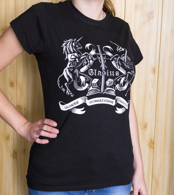
Create a T-Shirt Design for a Fantasy Association in Adobe Photoshop and Illustrator

Recently I was asked to design a T-shirt for the Legnica Fantasy Association, which my sister belongs to. Since it's a non-profit project, I decided to share my creative process with you. I'll show you how to create the idea, how to refine it in Adobe Photoshop, and how to create a two-color, ready-to-print vector out of it.
1. Form the Idea
Step 1
Sometimes the idea will come to you from nowhere, but most of the time you'll need to help it along. The easiest way to create something new is to find inspiration that's somehow linked to what you want to do.
And what do we want to do here? A kind of super-stylized logo for a Fantasy Association "Gladius". Members of Gladius meet up to talk about fantasy or sci-fi books, and play tabletop games like board games, card games, and, of course, role-playing games. This is what we need to include in our design.
So, the first step is to find images associated with this topic. Look at them and try to find something that links them all. How can they meet together in a one place? This step is the most important of them all, so take your time.

Step 2
We need to prepare the proportions of our designs. In the case of a T-shirt, the center of attention is the center of the shirt—you can try other compositions, but the middle-point will be the most successful one. It's because people look at a shirt, not really at the image—and the faster they get the message, the better. So, use a cross as your guide lines for a clear message.

Step 3
Sketch the idea/ideas very loosely, and see if it survives outside of your mind. Don't pay attention to the details, just create a big, solid form. If it's readable without details, you can be sure the primary message will be delivered.
Hint: if you look at your rough design and think "there's something I don't like about it, but it will look better when I add this or that", delete the file and start again. A building with weak foundations will certainly look better with curtains and plants on windowsills, but it will not work better.

2. Refine the Sketch
You can create the whole design traditionally, but it may take you more time. There's going to be lot of reshaping things, and it's certainly easier to do on layers. I will explain how to do it in Photoshop, but you can use other software for it.
Step 1
Place your sketch in a new file, lower its Opacity, and lock the layer. We'll need a new layer for every step.
First, I want to take care of the unicorns. One of them will be a normal magic animal, while the other one will be a skeleton—this way it will not get too sweet. So, we need to start with a horse body. You can use my tutorial about horses as a reference.
The pose defines the space used by the unicorn and the rhythm of its body, so pay good attention to it before adding the details.

Step 2
Use the pose as a base for the skeleton.

Step 3
Duplicate (Control-J) the skeleton and flip it horizontally (Edit > Transform > Flip Horizontal). Move the copied skeleton to the place of the other unicorn.

Step 4
Now we can easily use the skeleton as a base for the body of the other unicorn. First sketch the body without any details.

Step 5
When the body is established, we can add more details, like muscles...

...head...

...and decorations.

Step 6
I decided to place a scroll-like shield in the middle, where I'll put the name of the association. Draw just half of it.


Step 7
Just as we did with the skeletons, duplicate the half of the scroll and flip the copy horizontally, then place it in its spot. Then you can Merge (Control-E) the halves.

Step 8
To emphasize the middle, I added a fantasy sword along the vertical line of the cross.


Step 9
To make the image fuller and its secondary message richer, I added two dice and an open book.


Step 10
I placed a long sash under the crest to include the full name of the association.


Step 11
To make the caption a part of the picture, I've added similar sashes on the sides of the crest.

Step 12
Time for the name, in the end. In my case the name was a part of the secondary message—the shirt is going to be more decorative than informative.
I've used Minim font.

3. Shade the Sketch
Before we go to vector, we can use Photoshop's tools for a freer design. Illustrator holds you accountable for every line you draw, so let's not use it for the design of the shading.
Step 1
If you want to use a black T-shirt, add a new layer with a black background. Then duplicate the sketch and Invert (Control-I) its colors. Lower its Opacity to a very small value.


Step 2
Take a hard Brush or a Pencil and paint over the illuminated areas with gray. You don't need to be too precise about it. Remember to keep the contours unpainted.

Step 3
Use the same brush in white to paint another layer of light, this time only in the heavily illuminated areas. Use it as an opportunity to create important contours.

Step 4
Use the same trick for the other elements, keeping a proper balance between what you paint and what you leave.


4. Prepare the Vector File in Adobe Illustrator
Let's move to Illustrator!
Step 1
Create a New File. While the size of a vector file doesn't matter most of the time, here we need to pay attention to it. Why? We're going to use the smallest unit possible (1 point) for thin lines, and there's a risk they'll become smaller when being resized. Therefore, it's better to choose the final dimensions now, or make them a bit smaller than expected.

Step 2
Place the sketch in the file. Scale it and, if needed, crop the Artboard (Shift-O) to its proportions.

Step 3
Use the Eyedropper Tool (I) to pick both colors you used and save them asSwatches.

Step 4
Double-click the layer with the sketch to open the Layer Options window. SelectTemplate.

Step 5
Add a New Layer below the sketch and draw a big black Rectangle (M) to make the background.

Now we're ready to start building!

5. Vectorize the Idea
Why did I say building? Because, as I said before, Illustrator holds us accountable for every dot and line. For the final picture we need to get rid of the chaos element and do everything according to plan.
Step 1
Create a New Layer, and lock the others. Paint the white highlights once again, this time doing it in a clean way, with the Pen Tool (P) or the Pencil Tool (N). Keep all the paths closed and avoid thin, sharp elements.


When you're done with this step, the overall message of your design should be revealed even when the sketch is hidden.

Step 2
Do the same with darker highlights on a separate layer.

Step 3
Now we'll want to blend both highlights without adding any more colors. Let's use simple parallel hatching for it. If we do it properly, the lines should appear to be blending from a distance.

Fortunately, we don't need to draw the lines one by one. It's Illustrator, after all! Draw a 1 pt horizontal line with the Line Segment Tool (\). Use the color of the second highlight for it.

Step 4
Select the line and move it with Object > Transform > Move. First make a Copyunder it, then above it.


Step 5
Make the outer lines 0.5 pt wide.

Step 6
Select all the lines and Object > Expand. Then Unite them with Pathfinder.

Step 7
Drag the lines into Swatches panel. Then recolor them to white and drag once again. We've just created two hatching patterns!

Step 8
Blend gray parts to the background by drawing the pattern with the Pencil Tool (N) on a New Layer.

Step 9
Go to Object > Transform > Rotate to rotate the hatching. Select
-45 degrees and tick Transform Patterns only.

Step 10
Do the same to blend the white parts.

6. Clean It Up
Step 1
We want the hatching to become a part of the highlights, so that every color has its own layer. Converting patterns to shapes is a bit tricky, so be careful here:
- Select the pattern.
- Object > Expand.
- Object > Ungroup.
- Use Divide from the Pathfinder panel.
- Object > Path > Clean Up.
- Use Unite from the Pathfinder panel.
Now the hatching is ready for you to Unite it with the rest of its color. Do the same with the other one.

Step 2
Let's put the full name of the association on the sash. Use the Pen Tool (P) to draw curves for the text.

Step 3
Use the Type Tool (T) to convert the paths to a text area.

Step 4
Type the text. The font is Optimus Princeps.

Step 5
If your font looks too thin, you can add another stroke to it in the Appearance panel.

Step 6
We don't need editable text, but rather clean paths.
- Select the caption.
- Type > Outline Stroke.
- Object > Expand Appearance.
- Object > Path > Outline Stroke.
- Use Unite from the Pathfinder panel.


Step 7
Select both the caption and the white highlights, and use Minus Front from Pathfinderwhen holding Alt. This way you'll subtract the shape of the letters from the white.

Step 8
Once again take a look at colors. They're often printed darker than on the screen, so keep it in mind. Also, sometimes it's good to create an imbalance of C, M and Y for a tinted gray.

Step 9
For the last time check if everything's OK. I needed to move the sash a bit to center it.

Step 10
Prepare the file for printing. Depending on the printer, you may need an AI, EPS, or even PNG file (pay attention to the colors in the latter!). You can also create a mock-up of your design to imagine how it's going to look.


We're Ready to Print!
Now you know how to design and create a beautiful T-Shirt in two colors, without gradients. You can also use this technique to create clean illustrations and tattoo designs.
And here's how the T-Shirt looks on my sister:
Subscribe to:
Comments (Atom)


